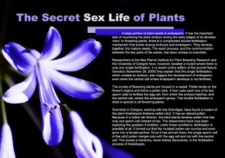
This is my Gelstalt exercise. I chose purple as the major color of this layout because it creates the feeling of mysterious. This feeling is quite suitable with the content of the article.
As the background picture is big and has a bright color, there is not much choice for me in choosing position for the text. I don't think it's a good idea to put the text on top of the flower picture. Therefore, I just put the paragraph in the blank area on the right. The 2 overlaped rectangles are used to highlight the content of the article.
No comments:
Post a Comment