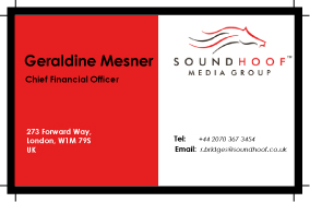
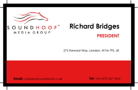
These 2 following images are business cards which are done for my exercise in class. Both of them have the theme of red and white which quite fits with the SoundHoof logo. The logo and blocks of text were arrange in grids. At the first card, the contents are symmetric through the center while in the second one, most of text were put at the right area. The only thing that I'm not really satisfy with is the color of text expecially with the telephone number and email. I made words "Tel" and "E-mail" be bold to distinguish them with the phone number and the e-mail address, but they looks wrong. I still don't have a solution to fix this problem (I tried to change the color of these words but they still looks distracted).


No comments:
Post a Comment