Saturday, January 13, 2007

DuplicateMovieClip() method in Flash

I've just found out that the duplicateMovieClip() method in Flash can be used to create interesting text effects easily. In this post, I will introduce a simple text effect using this method.

However, firstly, I will show how to change a content of a movie clip from outside. This technique is often used with the duplicateMovieClip() method to create variants of the original movie clips.

Now, I create a movie clip named "clip". In this movie clip, there is only a dynamic text box which is named "char". The content of the dynamic text box doesn't matter (I chose the letter 'A').


Now, we drag the movie clip into the stage and press Ctrl-Enter, it will show the letter 'A'. To change the content of this "clip" movie clip using ActionScript, we only need to type 1 of 2 lines of code into frame 1.

clip.char.text = "B";
or
set("clip.char.text", "B");

I prefer the way using the set() method as it is more flexible. You can do something like this set("clip.char"+".text","B").

So, it's time to use the duplicateMovieClip() method. This method has 3 parameters which are the name of the original movie clip, name of the copy and the depth (a movie clip having a bigger depth will be shown on top of the movie clip having a smaller depth). For example, to show a string "PHONG" (my name) on the screen, we use this code:

str = "PHONG";
size = length(str);
i = 1;

// hide the original movie clip
setProperty("clip", _visible, false);

for (i = 1; i <= 5; i++){
// create a copy of the original movie clip
duplicateMovieClip( "clip", "clip"+i, i );

// set the content of the copy
set("clip"+i+".char.text", substring(str,i,1));

// set the location of the copy on the screen
setProperty("clip"+i, _x, 20*i);
setProperty("clip"+i, _y, 100);
}

This is the source file for this text effect.

Friday, January 12, 2007

Photoshop's wave effect

Step 1: create a new Photoshop file with 400x400 pixels in size. White is chosen for the background colour.
Step 2: Filter/Render/Clouds (this is the most common step in generating a background picture in Photoshop.)


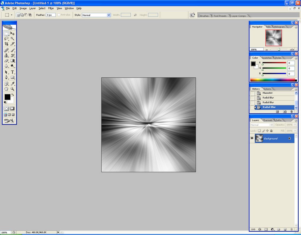
Step 3: Filter/Pixelate/Mezzotint. I choose Long Stroke in the Type box.

Step 4: Filter/Blur/Radial Blur with amount = 100, Blur Method = Zoom and Quality = Best. Press Ctrl-F 2 times to apply this effect 2 more times.


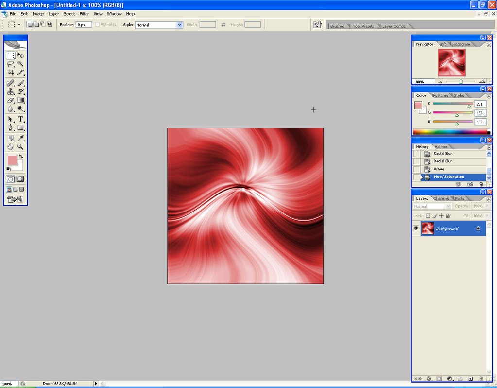
Step 5: Filter/Distort/Wave. You can experience changing numbers in the option box to create different results. This is my choice:


Step 6: Now, I apply colours for the picture by using Image/Adjustments/Hue&Saturation


Step 7: Dupplicate the layer, Image/Rotate Canvas/Flip Canvas Horizontally for the layer on top. Change the blending mode of this layer into Overlay and reduce its opacity as well. This is the result:


Step 8: Merge 2 layers together, repeate step 7 for the new layer but use the Flip Canvas Vertically and the Vivid Light blending mode.

Saturday, January 06, 2007

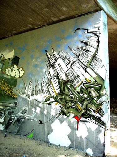
Graffiti

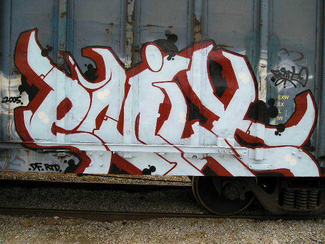
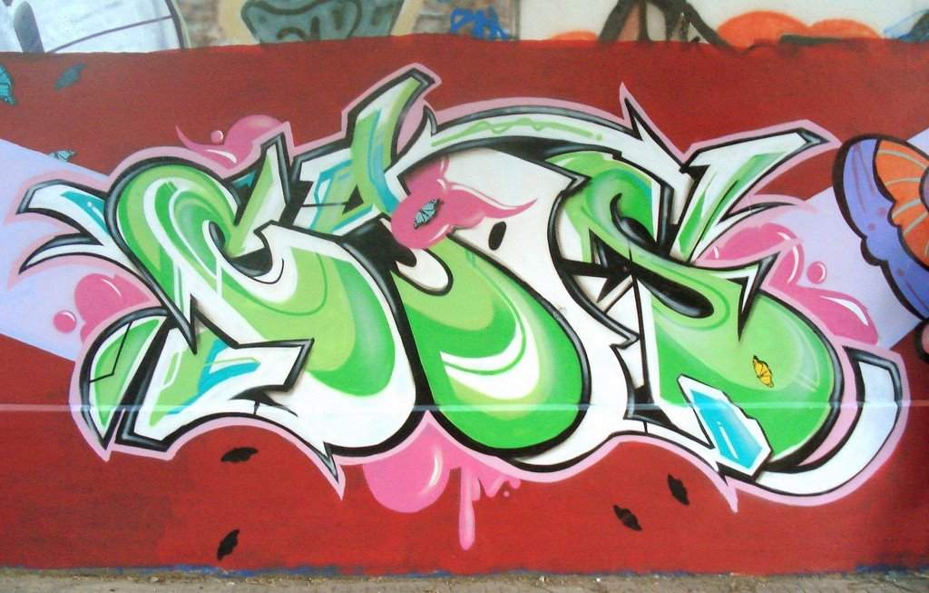
According to Wikipedia, "graffiti is the unofficial application of graphics on publicly viewable surfaces" such as on building's walls. Although graffiti has a long history with the first apperance in ancient Greek and Romans thousands ago; in this post, I only post artworks of modern graffiti which is an element of the Hip-hop culture.


References:
http://en.wikipedia.org/wiki/Graffiti
http://www.graffiti.org/trains/2007trains/emit_fr82006.jpg
http://www.graffiti.org/caos/caos_21.jpg
http://www.graffiti.org/rezine/geneve_dris_ep_cru_033.jpg

movies plot summary

I post some plot summaries of movies an which we have for the final flash assignment. These information are from the www.imdb.com.

Un Chien Andalou
Plot: This film uses a non-linear structure; so it doesn't have a real plot. The whole film is "a series of unrelated, and at times potentially offensive, scenes that attempt to shock the
viewer." (Wikipedia.org)
Casts:
Simone Mareuil
Pierre Batcheff
Luis Bunuel
Salvador Dali
Robert Hommet
Marval
Fano Messan
Jaime Miravilles

Der Golem
Plot: In this film, the Golem - a clay statue in the Jewish religious - was brought back to life by an antique dealer. It felt in love with the dealer's wife. And because of the rejection of her, it began a muderous rampage. (www.imdb.com)
Casts:
Paul Wegener
Rudolf Blumner
Robert A. Dietrich
Carl Ebert
Henrik Galeen
Lyda Salmonova
Jakob Tiedtke

The Cabinet of Dr. Caligari
Plot:
Jane's car breaks down and she makes her way to a nearby estate, owned by a mysterious man named Caligari. Soon she finds that she has become a virtual prisoner, and none of the strange inhabitants of the estate are willing or capable of helping her escape. Caligari reveals himself as a passive pervert, showing her filthy pictures, spying on her, and trying to make her talk about intimate details of her life. She attempts to free herself by the only means at her disposal. (summary written by Ed Sutton, www.imdb.com)
Casts:
Glynis Johns
Dan O'Herlihy
Richard Davalos
Lawrence Dobkin
Constance Ford
J. Pat O'Malley
Vicky Trickett
Estelle Winwood
Doreen Lang
Charles E. Fredericks
Phyllis Teagardin

Carnival of Souls
Plot: A group of teenagers lose control of their car which plunges off
a bridge into a river. They must be dead, think the local
townsfolk but out creeps a survivor who attempts to carry on
with life as she knows it. (summary written by Scott Dawson, www.imdb.com )
Casts:
Candace Hilligoss
Frances Feist
Sidney Berger
Art Ellison
Stan Levitt
Tom McGinnis
Forbes Caldwell
Dan Palmquist
Bill de Jarnette
Steve Boozer
Pamela Ballard
Larry Sneegas
Cari Conboy
Karen Pyles
T.C. Adams

Reference:
http://www.imdb.com
http://en.widipedia.org/wiki/Un_chien_Andalou

Saturday, December 30, 2006

Basic music theory

A staff is a most important part of every music sheet. It is made up by 5 horizontal lines as the following picture:


Notes will be put onto the staff and depends on the position of them on the staff, we can decide their names. For example, if we put a note on a second line counted from the bottom of the staff, this note will be G.

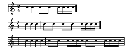
The next thing about notes is note values which are durations of specific notes. The following picture shows quite clearly about them.


A staff in music sheets is splitted by vertical lines. Each part of it is call a measure.


For example, in the above picture, all of the 3 staffs have 2 measures. The fraction number in the beginning of each staff is called the Time Signature. In the first staff, 2/4 means that the duration of each measure equals to the duration of 2 quarter notes. 3/4 time signature in the second one indicates that the duration of each measure equals to the duration of 3 quarter notes and so on.

There are also time signature with denominator which is not 4 such as 6/8. However, the meaning of them is the same except that we use eighth notes as a unit to measure instead of quarter notes. So, 6/8 means the duration of each measure in a staff equals to the duration of 6 eighth notes.

Reference:

Some common music genres

Pop music: “is a genre of popular music distinguished from classical or Art music and from folk music. The term indicates specific stylistic traits such as an emotional singing style, lyrics about love or sex, danceable beat, clear melodies, simple harmonies and repetitive structure so that people can catch on and join in.” (Wikipedia, 2006).

Some notable Pop music artists through periods:
1950s: Elvis Presley, Frank Sinatra.
1960s: the Beatles, the Rolling Stones.
1970s: Elton John, Cher and the Carpenters.
1980s: Michael Jackson, Madona
1990s: Celine Dion, Mariah Carey, Jessica Simpson, Britney Spears and Christina Aguilera.
200s: Pussycat Dolls, Hilary Duff.

Funk is an African American music style which was started by artists such as James Brown, the Meters and the Family Stone. This genre became a distinct genre since 1970s. According to Wikipedia, “Funk music is characterized by intensely syncopated, danceable rhythms with the emphasis falling heavily on the first beat of every measure; prominent bass lines; a distinctive, razor-sharp type of rhythm guitar; chanted or hollered vocals in the style of soul music; powerful, rhythm oriented horn sections; a strong emphasis on percussion, often including hand drums and other instruments as well as a drum kit; and African and jazz influences”. It was also believed that funk has influences on disco and hip hop genres which were developed later.

An artist which can represent to this genre is James Brown.

Disco is a music genre which is affected by Funk. At the first time, most of disco songs were created for nightclubs only (in the 1970s); but after that, they began to approach more common audiences such as radio listeners. The following list is some disco hits in the 1970s (Wikipedia):

Nelson James – “I Have An Afro” (1972)
Harold Melvin & the Blue Notes – “The Love I Lost” (1973) and “Bad Luck” (1975)
Love Unlimited Orchestra - "Love's Theme" (1973)
The Jackson 5- "Dancing Machine" (1973)
Barry White - "I'm Gonna Love You Just a Little More, Baby" (1973), "Can't Get Enough of Your Love,
Babe" (1974), "You're the First, the Last, My Everything" (1974)
Shirley & Company - "Shame, Shame, Shame" (1974)
The Hues Corporation - "Rock the Boat" (1974)
The Commodores - "Machine Gun" (1974)
Frankie Valli - "Swearin' To God (1975)
Dalida- "J'Attendrai" (the first French disco song and first hit in Europe) (1975)
LaBelle - "Lady Marmalade" (1974)
The Four Seasons - "Who Loves You" and "December '63 (Oh What A Night)" (1975)
Silver Convention - "Fly Robin Fly" (1975)
The Bee Gees - "Jive Talkin' " (1975)

Heavy Metal which began popular in the 1970s-1980s is a sub-genre of Rock. “It is characterized by guitar-and-drum dominated sound, strong rhythms and classical, bluesy or symphonic styles” (Wikipedia). Although the main theme of heavy metal songs is often about darkness and evil, they also has been divided in to sub-genres including thrash metal, death metal, black metal, power metal and doom metal (most of them was started in the 1980s).
Thrash Metal: characterized by faster, louder and more aggressive than the original one with notable artists including Anthrax, Megadeth, Metallica and Slayer (the 4 bands are also called the “Big Four Of Thrash” (Wikipedia).

Death Metal: is developed from thrash metal with fast drummers, high-pitch screaming and harsh metal vocal. Notable bands of this sub-genre are Nile and Suffocation.

Black Metal: was originated from Europe which has the theme mostly about Satan. Most black metal bands such as Mercyful Fate, Bathony and Celtic Frost often used shrieked vocals, dark atmosphere and highly distorted guitar.

References:

Saturday, December 23, 2006

A free webpage to download music

In the previous 2 semesters, the only webpage I used to download music for my flash is http://freeplaymusic.com. However, when I was doing a flash about font, I looked for an opera song for my flash as my font was a Venetian Oldstyle font. But I couldn't find any coz the http://freeplaymusic.com only has general categories such as classical, jazz,...

So, I had to find another music download page and I found http://music.download.com. This page categorize its music much better with sub-categories for each general categories (e.g in the classical category, there are sub-categories about Classical guitar, Concerto, Medieval, Renaissance and more).

References:
http://freeplaymusic.com
http://music.download.com

Using mask in Flash

In this post, I will present a quite interesting example about masking in Flash. This technique changes a grayscale picture into a color one. I have used this technique is my font advertising assignment as well.

To begin, you need 2 pictures of the same thing, one in colors and one in grayscale. Then, each picture is put on a layer with the layer of the colored picture on top (in the .fla file, these 2 layeres are named "color picture" and "grayscale picture").

After that, you create a new layer which is on top of both "color picture" and "grayscale picture" layers and name it "mask". The next to do is drawing a small black circle in this layer and making a motion tween to make the circle's size be bigger than the scene's size. Finally, right-click on the "mask" layer and choose Mask.

Download .fla source file here

Saturday, December 16, 2006

FreeFoto.com

I've just found a free image stock website on the internet. It's address is http://www.freefoto.com. This website has more than 100,000 images which are organized into 3043 categories. It is known as the largest collection of photographs for non-commercial purposes.

This is some pictures about Roma in this website.


References:
http://www.freefoto.com/preview.jsp?id=14-26-3&k=Trevi+Fountain%2C+Rome%2C+Italy
http://www.freefoto.com/preview.jsp?id=14-26-51&k=Trevi+Fountain%2C+Rome%2C+Italy

Centaur font research

Centaur was designed by Bruce Rogers in 1928. It was arranged in the Venetian category in the MyFonts website with Palatino, Vendetta, Stempel Garamond and more fonts.

About Bruce Rogers
Bruce Rogers (1870 - 1957) is a typographer, type designer, illustrator and artist. He used to train as an artist at Purdue College near Lynnwood. From 1894, he produced graphics for "Modern Art" magazine. 1915, he design the book "The Centaur" for Montague Press.. After that, he worked at different places such as Cambride University Press and Harvard University Press from 1920-1928, W.E.Rudge publishers from 1929-1931, Oxford University Press and Emery Walker in 1935.

Some of his publication: "Paragraphs of printing", "Bruce Rogers, a life in letters"

About Centaur font
In 1458, Charles VII sent the Frenchman Nicolas Jenson to learn the craft of movable type in Mainz, the city where Gutenberg was working. Jenson was supposed to return to France with his newly learned skills, but instead he traveled to Italy, as did other itinerant printers of the time. From 1468 on, he was in Venice, where he flourished as a punchcutter, printer and publisher. He was probably the first non-German printer of movable type, and he produced about 150 editions. Though his punches have vanished, his books have not, and those produced from about 1470 until his death in 1480 have served as a source of inspiration for type designers over centuries. His Roman type is often called the "first true Roman." Notable in almost all Jensonian Romans is the angled crossbar on the lowercase e, which is known as the "Venetian Oldstyle e."

Centaur which is designed by Bruce Rogers is a re-creation of the roman type cut by that Nicolas Jenson in the fifteenth century. The name Centaur was used because Bruce Rogers was used this font the first time for the book "the Centaur" by Maurice de Guérin, published in 1915. Lanston Monotype of London cut the commercial version of Centaur and released it in 1929. The Centaur Family Font is often used for book composition, headlines and elegant advertising pieces.

References:
www.myfonts.com

My social welfare poster

I chose the topic about ecouraging people to use public transportation. The bitmap image which was used in this poster is an image of empty seats in a bus at Ben Thanh market. Combined with the text about 11000 people die every year, this image shows one reason for the high traffic accidental rate is because people don't want to use buses. I used Photoshop to make the picture look like a hand-drawing picture with grayscale in other to create a sad mood for this piece.

Saturday, December 09, 2006

Photomontage

This is my self portrait as a machine. I called this is a "MP3 maniac" picture because I combined components which are related to playing and storing MP3 music. For example: the eyes of the character were actually speakers, the head was cut from the IPod, the neck was the headphone plug and etc.

Social Welfare Posters

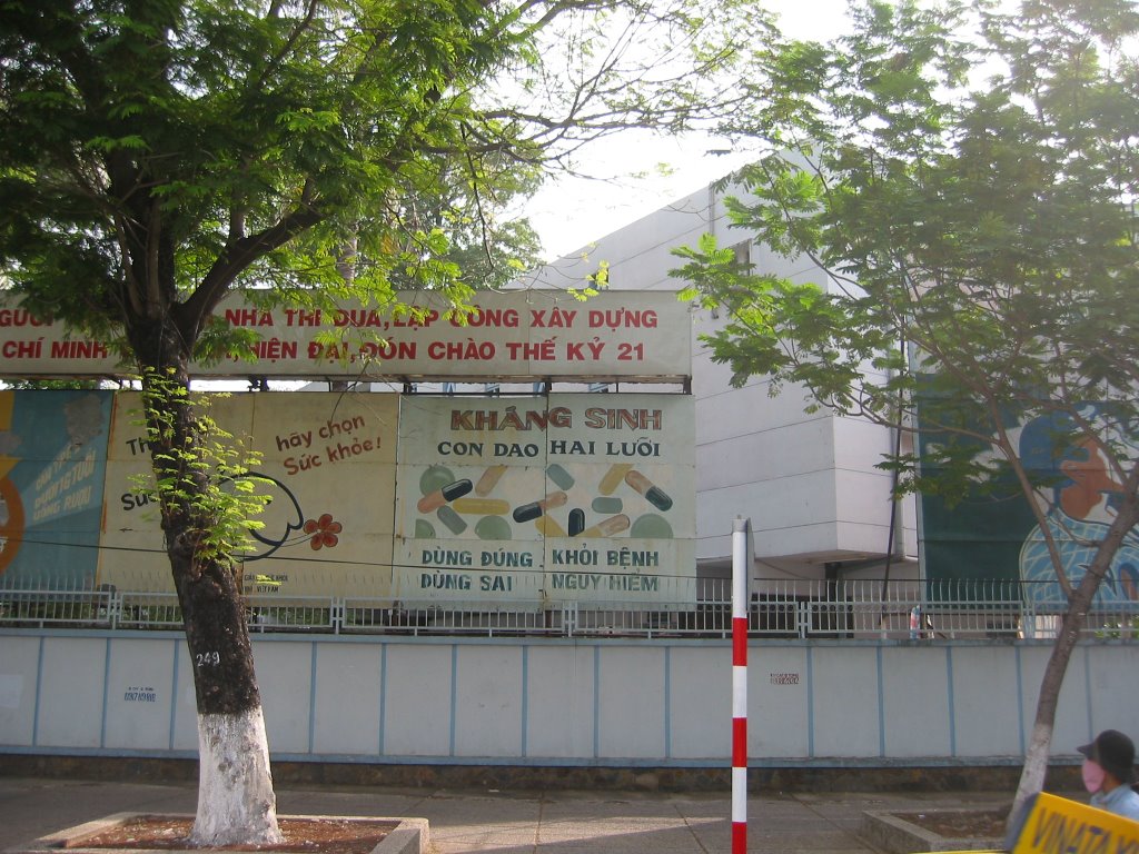
These are social welfare posters which I saw in Ho Chi Minh City's streets.

I really can't remember exactly where I saw this poster. It is somewhere near the Coop Mart Cong Quynh. This poster is telling people that selling women and children must be stopped.
The second poster which is about birth control is placed right in front of Tu Du hospital. The text in this poster basically means "Stop at 1 or 2 children for good raising"
This poster is on Nguyen Thi Minh Khai Street. It is a poster about environment. It tells people not to pollute the air.

And the last one is on Cach Mang Thang Tam Street. Its message is about avoiding antibiotic abuse.

Friday, December 01, 2006

Winston Smith's Montage Art

In this post, I'm going to show some of montage artworks of Winston Simith. These pieces were downloaded from his website www.winstonsmith.com. In this website, there are a lot of montages which are arranged into various categories based on their topics. These following ones are my favourite pieces.


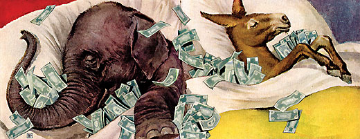
The first one was entitled "Strange Bedfellows". In this montage, an elephant and a donkey are sleeping on the same bed which is full of money, and their back are faced against each other. As the elephant and the donkey are the symbol of the Republican Party and the Democratic Party - the two most powerful political parties in the United States, this picture made me think that Winston Smith was trying to draw the political background of the United States, politicians just try to compete to each other to protect and increase their own benefits.

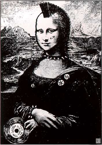
The second piece is also interesting. The author has modified the Mona Lisa picture into a woman dressing like a rocker in the 1970s. This picture reflects the movement of youths in that period.
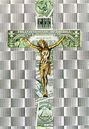
And the last montage is a quite familiar picture. It is the picture of the Jesus Christ dying on the crosswooden structure. However, the name of this piece is "In God We Trust" which is the motto of the United States. Moreover, the Cross was also combined from the US dollars. I don't quite understand what does piece mean but in his website, Winston Smith said that this montage is the art for dead Kennedys.

References:
http://www.winstonsmith.com/gallery/book3/big/strange.html
http://www.winstonsmith.com/gallery/book1/big/mona.html
http://www.winstonsmith.com/gallery/book1/big/idol.html

Business cards

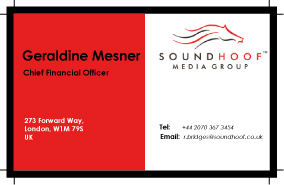
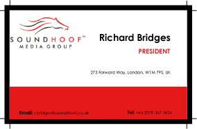
These 2 following images are business cards which are done for my exercise in class. Both of them have the theme of red and white which quite fits with the SoundHoof logo. The logo and blocks of text were arrange in grids. At the first card, the contents are symmetric through the center while in the second one, most of text were put at the right area. The only thing that I'm not really satisfy with is the color of text expecially with the telephone number and email. I made words "Tel" and "E-mail" be bold to distinguish them with the phone number and the e-mail address, but they looks wrong. I still don't have a solution to fix this problem (I tried to change the color of these words but they still looks distracted).

Saturday, November 25, 2006

Some posters of Iranian designers

In this post, I will introduce some work of Iranian designers. These pictures were download from the Icograda website, which has a big collection of artworks - mostly are posters - from various designers.

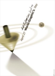
The first one is a poster of Mehdi Mohammadi named "April 27 World Graphic's Day". This one looks quite fuzzy and clean. The way objects are slanted combined with this blur also helps to create the feeling of motion. Mohammadi has used both Arabic and English language for his text. The selection of color for text is also fit with the theme of the design and it makes the world World Graphic's stand out.


This poster has a quite long name which is "The Friendship Association of Iran and Switzerland identity". It is a design of another Iranian designer, Iraj Mirza Alikhani. This poster was inspired from national flags of Iran and Switzerland. The green and red colors of the Iran's national flag looks rough like they were painted by color pencils. The way using negative space to form the cross shape is also original.

References:
http://www.icograda.org


The Scar - Peter Prabowo

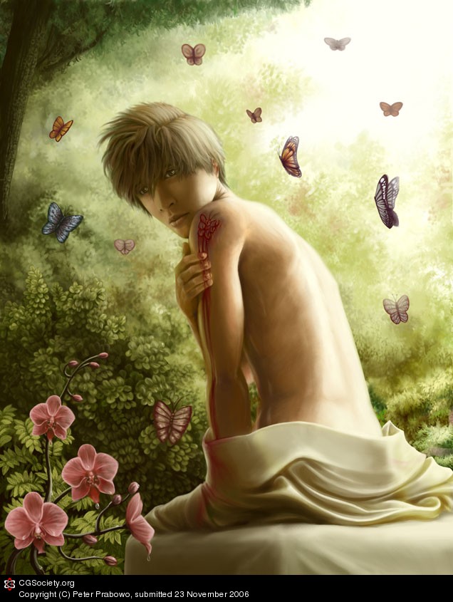
This piece, entitled "The Scar", is a artwork of Peter Prabowo - an Indonesian. It is an example of CG images, a kind of images produced with the help of tools in computer software. At the beginning, this picture was just a pencil drawing. Using Photoshop, Prabowo has colored the original sketch and adding some lightning effect and shades.

The whole image looks bright and smooth. And I really like the way he adding shadows which is very detailed on the clothes and on the face. The topic of this picture is also quite fantasy.

References:
http://forums.cgsociety.org/showthread.php?t=433017

Saturday, November 18, 2006

Color Theory

Color Basics

According to the definition in the worqx.com website, color is a perceptual characteristic of light. There are 3 major factors which are used in describing a color: its name, how pure it is and the value of its lightness. Hue is the value of the color (the color name), the purity of a hue is indicated by the value of saturation and the intensity value decides the brightness of a color.

A hue can has a number of variations which are created by mixing a pure hure with different colors. The 2 most important variation of a hue called shade: a variation produced by adding black color and tint: a variation produced by adding white color.

Major Color Systems

RGB Color System: this is an additive color system which is usually seen in computer screen. We call it as an additive color system because as more colors are added into it, it will produce a brighter result color. 3 primary colors of the RGB color system are Red, Green and Blue.

CMYK Color System: this system is called as a subtractive color system which is mostly used in printing. Although it only has 3 primary colors which are Cyan, Magenta and Yellow, the Black color is added into this system to produce a black color (practically, there is impossible to produce a pure black color by mixing cyan, magenta and yellow).

Besides these most popular ones, there are also have other color systems which are used in more specific situations such as the HSV color system.

The Color Wheel

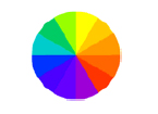
Traditionally, the color wheel is a color circle including 3 colors which cannot be produced by mixing any others colors. They are Red, Blue and Yellow. So, the color wheel with only these 3 primary colors is called as a primary color wheel.

Primary Color Wheel
The Secondary Color Wheel contains primary colors and colors produced by mixing primary colors.

Secondary Color Wheel

And the Tertiary Color Wheel addes colors formed by mixing primary colors and secondary.


Tertiary Color Wheel

Based on the Color Wheel, there are some terms describing the combination of colors:


Analogous Colors: the combination of colors which are located closed together on the color wheel.

Complementary Colors: the combination of colors located opposite each other on the color wheel.

Monochromatic Colors: the combination of a pure hue and its variations.

References:
http://www.worqx.com/color/color_basics.htm
http://www.colormatters.com/colortheory.html
http://www.worqx.com/color/complements.htm


web templates

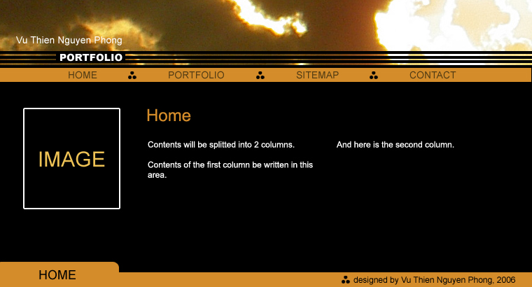
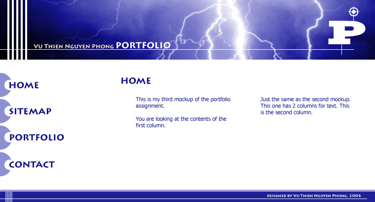
These are my 2 other web templates


This is my first design. I started this design by experimenting to combine 3 colors: black, white and dark orange. The color combination creates a lovely contrast and makes the text stand out clearly. Since I don't use background image, this piece has a clean design which will help audiences easier to read and navigate through the contents.The text for contents is arranged in 2 columns. I hope this arrangement creates more spaces for text and.


And this is my second one, it is quite similar to the first one with the way to design banner, footer and contents text. However, the theme of this design is different: main colors of this design are blue and white. The colors are also brighter which make this design look young and more dynamic.

Thursday, November 09, 2006

Website template


Here is my website template. I tried to make this layout look technological and a bit futuristic. However, I think this layout is lack of negative space because the banner (pieces of rectangle at the top) looks a bit messy.