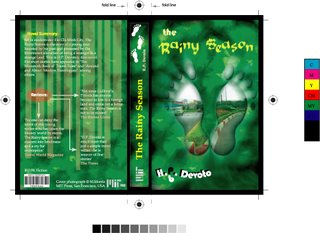
This is my book cover assignment. After submitting, I recognized that I made a mistake about the position of text on the spine. But anyway, footprints in my design are inspired from the idea of the traveller. The picture of a rainy day was put into the footprint. And I also tried to create a background which is fuzzy like a fog with the combination between dark and light areas; and after playing with the photoshop brush for a while, I got this background.
1 comment:
hmmm... the overall cover is relatively cool, but I think if the placement of 2 feet was not too "straight" (do u understand wat I mean?) it'd be more awesome... since the idea focuses on the travellers, rite? when you're walking, your feet dont really look like that ^^ anyways, that's only my opinion.
however, I like your PS effect to make the feet and some patterns of the background blurry
Post a Comment