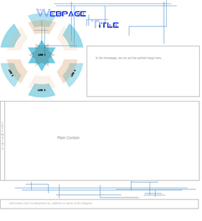
Welcome to my first post of semester 3. This is the webpage which I designed in the semester break. Actually, I designed it for my father - a highschool mathematics teacher. He has some maths classes at home; so he wants his students can download exercies and lectures from the website (I think another reason is because he didn't want me to play all the semester break :D).
His website is at http://www.thiencan.net/. You can take a look at it to see the full website.
Anyway, it just a small website with 6 html files to introduce about my father, some maths exercises to download and some family photos. I used a lot of blue lines and overlapped objects on the white background to create a modern style. The small number of colors and typography also helping this webpage to looks clean and bright.
As I don't like complex tables which often make me mess up, I decided to design the website in Illustrator (including the heading) and then split it up with the Photoshop slice tool. The only problem of that is there are many images are created. As each page of the website was divided into 19 parts averagely, there were total nearly 120 images just for the background (there were 30-40 more for family pictures). I don't know how to solve this problem and it really takes a lot of time for uploading using HTTP protocol (I can only upload 12 files at one time).
2 comments:
Well I like the idea of ur banner, looks very utopia to me. However, i think it would be better if u give it some lines or borders to divide things in the site like banner, body, menu, footer, etc and the banner seems a bit small compared to the main block of text down there. Anyway, it's nice and I just love the colors! :))
Use an image-map!!! :)
Post a Comment