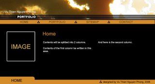
 This is my first design. I started this design by experimenting to combine 3 colors: black, white and dark orange. The color combination creates a lovely contrast and makes the text stand out clearly. Since I don't use background image, this piece has a clean design which will help audiences easier to read and navigate through the contents.The text for contents is arranged in 2 columns. I hope this arrangement creates more spaces for text and.

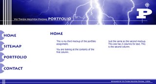
And this is my second one, it is quite similar to the first one with the way to design banner, footer and contents text. However, the theme of this design is different: main colors of this design are blue and white. The colors are also brighter which make this design look young and more dynamic.
1 comment:
I really like the first one - brown - it's much more elegant without the gimicky blue and white: "button's that scream "I'm a button",
Post a Comment