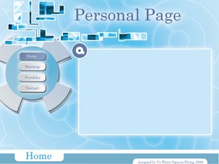
Here is my website template. I tried to make this layout look technological and a bit futuristic. However, I think this layout is lack of negative space because the banner (pieces of rectangle at the top) looks a bit messy.
This is the place to show some crazy things for my online visual diary.
2 comments:
hmmm I have to admit that I like ur navigation, it looks cool and strong! Moreover, I think the striped background makes it more eyecatching to view... =]
However, in my opinion, the little images above the navigation could distract viewers from text and other matters... if you could discard them or place them into other places, it'd be more balanced for the web... ^^
Whatever, the blue background wif its creative shapes is outstanding... it reminds me of the Animax website, its main color is blue too :D
Post a Comment