Sunday, July 30, 2006

Saigon Running Club Card


The background was filled with gradient orange as I want to create the sense of energy. On this card, I used 2 fonts with 4 different colours to create the variant for text.

My Business Card


This is my business card. Due to follow exercise requirements, I can't do much with the text. I only change the font size, bold/italic and apply the effect.

Sunday, July 23, 2006

Type Exercises

Hi,
This is my type exercises including: creating layout for an essay, creating layout for a recipe and make 3 variations of the real estate logo.

When designing a layout, the most difficult part that I encoutered was drawing decorative items (eg. these circles in my essay layout). I wanted to use more decorative items to make my layout look professional, but it became hard to choose colours for them (there is a limit number of colours that are match together).


The Essay Layout


The Recipe Layout


Variations of the Logo


An example of picture drawn by computer software


The author of this picture has drawn it by a computer software. I like the way he using colours. The greenish sky looks totally unrealistic and it makes me think about the sky in some cartoon or computer games.The tree which is growing in the horizontal direction and clouds floating nearly the ground create the sense this is the land on a different planet.

References
http://www.deviantart.com/view/33554525/

Saturday, July 15, 2006

Colour Exercise


And this is my colour exercise. I spent a lot of time on choosing fonts for the texts because I can't preview font in Photoshop 7 (my computer has nearly 800 fonts ><). I hope you guys don't think all of them are bad, and I'm looking forward to your comments.

Spider Web


In this picture, the background (the river and trees) are blured. It looks like being covered by a curtain of fog. The spider web with drops of water comes out as strings of crystals attached together. If we remove the background, this picture will only focus on lines and shapes and it will look really abstract to me.

Reference
http://digitaltirade.com/Artwork/Images/Full/webbg.jpg

Lights out


This pic is called "lights out". It looks like be captured by somebody who is under the water (the light can be the moon light).

I choose it may be because it gave me an intertextual reference of the film Cat Woman. There is a scene in this film having the similar camera angle like this. If I remember right, this is the scene when the body of a woman floating on the water before she reborn as the Cat Woman.

Through this picture, we can see both the contrast and blending between bright and dark areas.

Reference
http://digitaltirade.com/Artwork/Images/Full/Lights-out.jpg

Playing with text and colours


This picture used a strange rule of uppercase and lowercase characters (the first character of a word is uppercased while the rest are lowercase).

Moreover, although it is mainly a grayscale picture, levels of grey in texts are different. This combines with the variety in size make texts more attractive.

With the word "PEACE". 5 different colours are used for 5 character. The combination betwen cool and warm colours with blur effect create the harmony for the word. This word is also the only word using colour in this picture. Through the gaze of the child to this word, it expresses the meaning of hope, "PEACE" is what this child desires desperately.

Reference
http://www.4mycanada.ca/images/Posters/VOTE%20POSTERsm.jpg

Friday, July 07, 2006

Composition

Solar Eclipse

This picture is inspired from the sunflower picture in the abstract exercise. It applies the principle of dominance/subordination. You can see the black circle with yellow edges emerges from the white background and attracting readers' eyes. Through this picture, the fierce battle between light and darkness is demonstrated.


The two-faced man

This picture illustrates the principle of coherence. The meaning which I tried to put in this picture is that experiments and achievements/ trial and success are unseparatable.


KISS

The principle of rhythm is presented in this picture. I only explain a bit about the text below the 3 Xs. "KIS" is a term using commonly in software programming (it's actually an advice for coding style) and it means "Keep It Simple".

New Life


Another photograph of Mireille Jansen at http://www.mireillejansen.nl/photography.php?work=new_life.

These 2 eggs on a nest represents to new lives preparing to begin. The branches and green leaves makes me think about the power of Mother Nature who creates and protects lives. I think this is a good picture to make posters about environmental protection.

High in the sky


This above picture is an artwork of Mireille Jansen. She is not a professional artist (she's just 18 years old), but some of her photograph really impressed me. If you visit her website (http://www.mireillejansen.nl/), you will see she took picture of many objects at a close distance to create new meanings for common objects.

At this picture, Jansen only used a small part of the model's face with the left eye looking upward. As the position of the eye is nearly the center, it captured all of our attention and showing the artist's personal attitude about the future. Through the confident look, the artist is looking forward to both successes and obstacles on the road ahead of her life .

Refenrences: http://www.mireillejansen.nl/photography.php?work=high_in_the_sky

Samurai

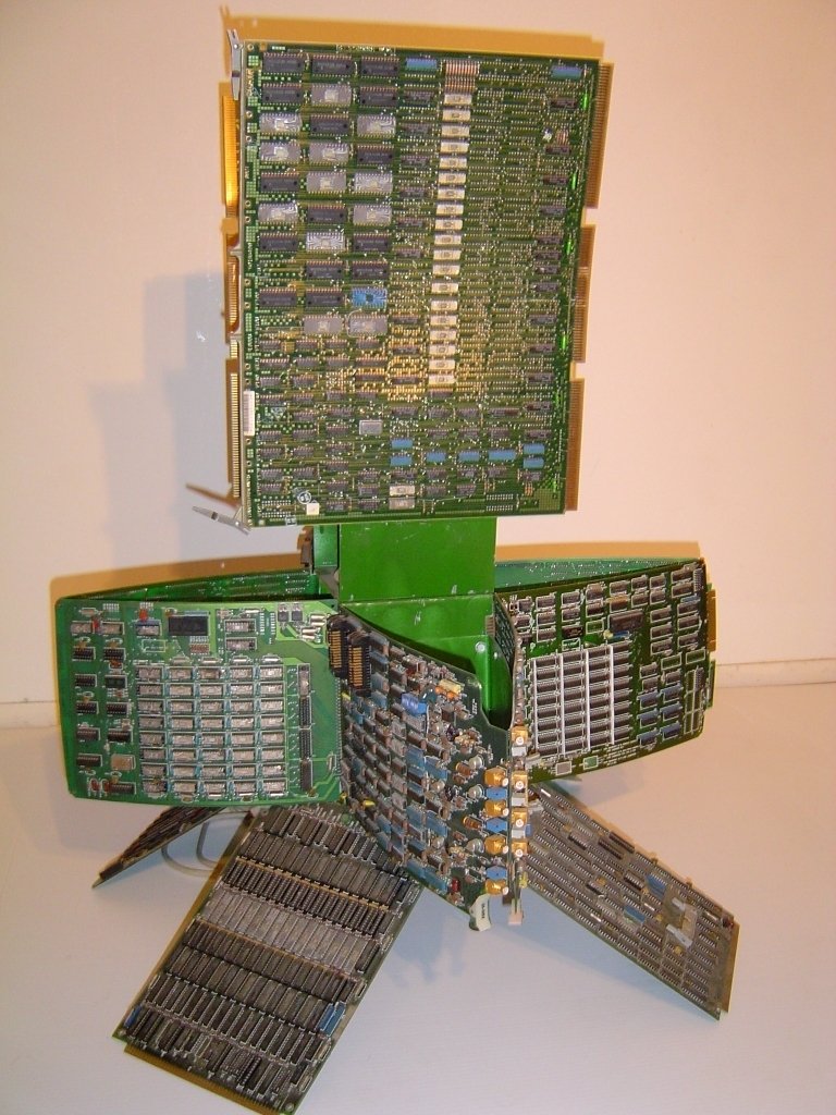
Samurai is a sculpture which exhibited at the Electronic Sculpture Recycled Art in 1994. As you can see in this picture, computer boards are arranged to form a Japanese warrior's shape in his armor. This stable symmetric structure performs a perfect combination between modern technology and traditional values of Japan. It argues that we can't just focus on the future and refuse the past. If there is no past, there is no future.

Reference :http://www.alexandromeda.com/html/Samurai01.html

Saturday, July 01, 2006

The current of time


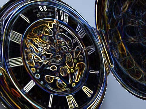
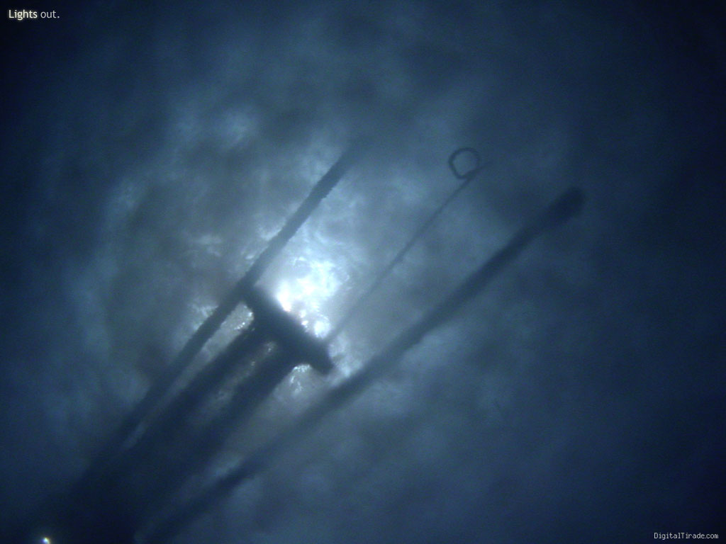
This above image is the image of the pocket watch from BlackBoard after applying the glowing edges effect of Photoshop.

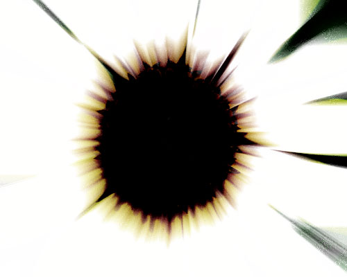
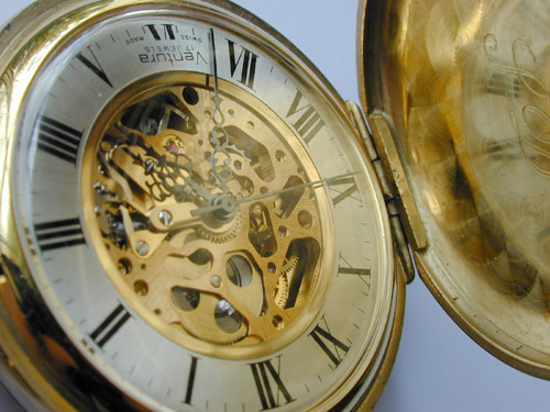
And this is the original picture from BlackBoard.


As you can see, just one special effect changed totally the meaning of the image. At the orginal one, you can see the metal pocket watch with the shining golden colour and all of its details is emerged from the background. You can see a lot of pictures like it in advertisments, newspaper when they talk about the evidence of the modernity. In most of cases, when talking about the modern age, people always show spacecrafts, skyscrapers and modern machines because they believe that technology is equal to modernity. And this image also support to the theory that the better the technology is, the better our world will become.

However, after applying the effect, this image was changed dramatically. About the appearance, the black colour replaced the golden one. The hour hand, the minute hand and all of clock's details became hard to recognize. Moreover, the meaning of this image is nearly inverted. This image doesn't equalize technology with modernity anymore. Instead of that, the mess of shape and Roman numbers shining on the black background make me think that technology also creates some problems. The round shape of the clock refers to our world which is ruined by technology. This image also predict the bad future when technology make the world become chaotic place.

A happy couple


I found this image from a picture gallery on the Internet at www.wheelchairanglingandhamradio.co.uk. The exact location is : http://www.wheelchairanglingandhamradio.co.uk/images/Funny%20Shaped%20Vegetables.jpg

At the first time looking at this picture, I was very surprise about the unsually shape of these carrots. They look like a man and a woman. I'm really not sure they are real carrots or this picture is made by Photoshop. However, I like this picture because I can feel the emotion of the carrots. The carrot at the left looks like a woman crossing her legs (it's a very feminine gesture) and the man (the carrot at the right of the picture) is peeking at her with his admiration.

Moreover, the nature colour of carrots make this image become more interesting. This red-orange colour makes me think that these carrots is blushing like a couple at their first date. If they are some other kind of vegetables (for example: potato) instead of carrots, I'm sure that this picture is much less interesting.