Color Basics According to the definition in the worqx.com website, color is a perceptual characteristic of light. There are 3 major factors which are used in describing a color: its name, how pure it is and the value of its lightness. Hue is the value of the color (the color name), the purity of a hue is indicated by the value of saturation and the intensity value decides the brightness of a color.
A hue can has a number of variations which are created by mixing a pure hure with different colors. The 2 most important variation of a hue called shade: a variation produced by adding black color and tint: a variation produced by adding white color.
Major Color Systems
RGB Color System: this is an additive color system which is usually seen in computer screen. We call it as an additive color system because as more colors are added into it, it will produce a brighter result color. 3 primary colors of the RGB color system are Red, Green and Blue.
CMYK Color System: this system is called as a subtractive color system which is mostly used in printing. Although it only has 3 primary colors which are Cyan, Magenta and Yellow, the Black color is added into this system to produce a black color (practically, there is impossible to produce a pure black color by mixing cyan, magenta and yellow).
Besides these most popular ones, there are also have other color systems which are used in more specific situations such as the HSV color system.
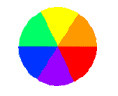
The Color WheelTraditionally, the color wheel is a color circle including 3 colors which cannot be produced by mixing any others colors. They are Red, Blue and Yellow. So, the color wheel with only these 3 primary colors is called as a primary color wheel.
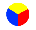
Primary Color Wheel
The Secondary Color Wheel contains primary colors and colors produced by mixing primary colors.
 Secondary Color Wheel
And the Tertiary Color Wheel addes colors formed by mixing primary colors and secondary.
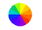 Tertiary Color Wheel
Based on the Color Wheel, there are some terms describing the combination of colors:
Analogous Colors: the combination of colors which are located closed together on the color wheel.
Complementary Colors: the combination of colors located opposite each other on the color wheel.
Monochromatic Colors: the combination of a pure hue and its variations.
References:
http://www.worqx.com/color/color_basics.htm
http://www.colormatters.com/colortheory.html
http://www.worqx.com/color/complements.htm
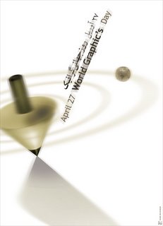 The first one is a poster of Mehdi Mohammadi named "April 27 World Graphic's Day". This one looks quite fuzzy and clean. The way objects are slanted combined with this blur also helps to create the feeling of motion. Mohammadi has used both Arabic and English language for his text. The selection of color for text is also fit with the theme of the design and it makes the world World Graphic's stand out.
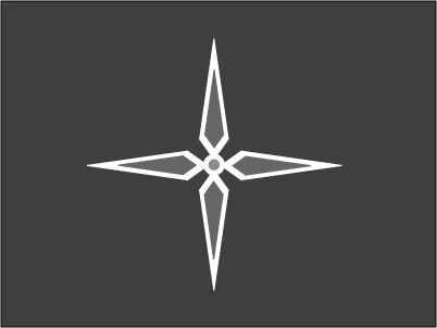
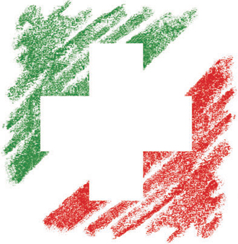 This poster has a quite long name which is "The Friendship Association of Iran and Switzerland identity". It is a design of another Iranian designer, Iraj Mirza Alikhani. This poster was inspired from national flags of Iran and Switzerland. The green and red colors of the Iran's national flag looks rough like they were painted by color pencils. The way using negative space to form the cross shape is also original.