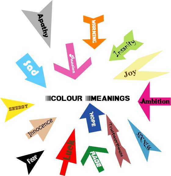
And this is my colour exercise. I spent a lot of time on choosing fonts for the texts because I can't preview font in Photoshop 7 (my computer has nearly 800 fonts ><). I hope you guys don't think all of them are bad, and I'm looking forward to your comments.
2 comments:
@ Phong: Do you use Illustrator to draw them? I know a tool in Photoshop which let you draw arrows freely. Dont why why but I prefer Photoshop to Illustrator :D
I like the way you used arrows with different shapes and colors to express ur idea, guy ^.^ so creative! Good work!
@ LAnh: "arrow", not "narrow" =))
I like the word "color meaning" the typeface is great and modern, it also looks like some kind of motion too , maybe because of the stripes ^^. I like how u put those arrows cuz it draws my attention to the center right after I see it! However, the gray "apathy" arrow is a bit big I guess. Besides that, it's great! ^^
Post a Comment