This is the place to show some crazy things for my online visual diary.
Sunday, July 30, 2006
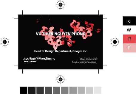
My Business Card
This is my business card. Due to follow exercise requirements, I can't do much with the text. I only change the font size, bold/italic and apply the effect.
1 comment:
I see have you chosen spot colors, what are the Pantone color names? Be careful of using spot color when there are gradients in the image.
Gradients that consist of just one spot color and tints (has white added) of that color are easier to print.
If the gradient consist of two colors, none of which is white, it is better to use the 4 color CYMK process to print.
As for the design, you could have used different fonts, fonts sizes, and placement of elements.
I really don't like the effect that you've applied to the address. I creates too many font styles in such a small design
Post a Comment