This is the place to show some crazy things for my online visual diary.
Sunday, July 30, 2006
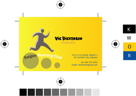
Saigon Running Club Card
The background was filled with gradient orange as I want to create the sense of energy. On this card, I used 2 fonts with 4 different colours to create the variant for text.
Hi Phong, I like the gradient background with several suitable fonts... what a outstanding combination! ^^ I also like the smart placement of 3 small circles.. congrats, Phong!
hehe, after saw ur typography exercise and this biz card exercise, i can tell that you really like circles. It looks cool and suitable with the context. The color is great and eye-catching, maybe because it's a hot color.
But hey, i wish u could post a bigger immage so that we can "enjoy" it, ur image is a bit small ^^
Sorry about the small size, but I have to keep it at 10x6.5 cm. May be u can click on it to see the original file (blogger scaled down it a bit to fit with the page).
Again, is this gradient created from just one color or two? This will determine a use spot colors or CYMK to print.
I like your choice of font for the name "Vic Dickenson". The word "Treasurer" is a bit hard to read since the color is so similiar to the background that it almost blends in. More contast needed.
The three circles are nice. The blue color for the contact info does not fit with the rest of the design. Would look better it if it matched a font color already used in the design.
5 comments:
Hi Phong,
I like the gradient background with several suitable fonts... what a outstanding combination! ^^
I also like the smart placement of 3 small circles.. congrats, Phong!
hehe, after saw ur typography exercise and this biz card exercise, i can tell that you really like circles. It looks cool and suitable with the context. The color is great and eye-catching, maybe because it's a hot color.
But hey, i wish u could post a bigger immage so that we can "enjoy" it, ur image is a bit small ^^
Anyway, good job Phong ^^
HI
I like your card
when i see it ,I can fell a lot of energy and ready to run.
Well done
Sorry about the small size, but I have to keep it at 10x6.5 cm. May be u can click on it to see the original file (blogger scaled down it a bit to fit with the page).
Again, is this gradient created from just one color or two? This will determine a use spot colors or CYMK to print.
I like your choice of font for the name "Vic Dickenson". The word "Treasurer" is a bit hard to read since the color is so similiar to the background that it almost blends in. More contast needed.
The three circles are nice. The blue color for the contact info does not fit with the rest of the design. Would look better it if it matched a font color already used in the design.
Post a Comment