Friday, December 01, 2006

Winston Smith's Montage Art

In this post, I'm going to show some of montage artworks of Winston Simith. These pieces were downloaded from his website www.winstonsmith.com. In this website, there are a lot of montages which are arranged into various categories based on their topics. These following ones are my favourite pieces.


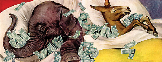
The first one was entitled "Strange Bedfellows". In this montage, an elephant and a donkey are sleeping on the same bed which is full of money, and their back are faced against each other. As the elephant and the donkey are the symbol of the Republican Party and the Democratic Party - the two most powerful political parties in the United States, this picture made me think that Winston Smith was trying to draw the political background of the United States, politicians just try to compete to each other to protect and increase their own benefits.
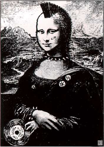
The second piece is also interesting. The author has modified the Mona Lisa picture into a woman dressing like a rocker in the 1970s. This picture reflects the movement of youths in that period.
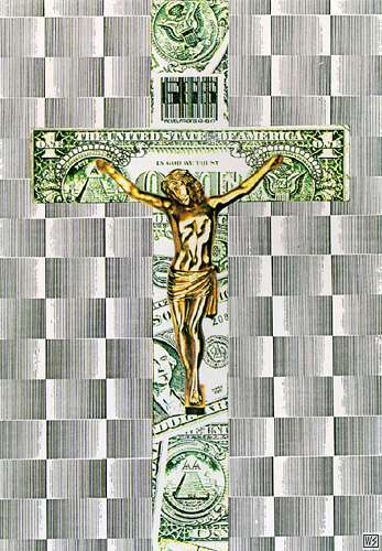
And the last montage is a quite familiar picture. It is the picture of the Jesus Christ dying on the crosswooden structure. However, the name of this piece is "In God We Trust" which is the motto of the United States. Moreover, the Cross was also combined from the US dollars. I don't quite understand what does piece mean but in his website, Winston Smith said that this montage is the art for dead Kennedys.

References:
http://www.winstonsmith.com/gallery/book3/big/strange.html
http://www.winstonsmith.com/gallery/book1/big/mona.html
http://www.winstonsmith.com/gallery/book1/big/idol.html

Business cards

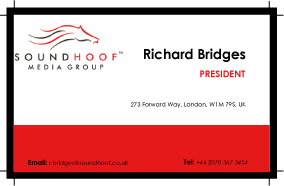
These 2 following images are business cards which are done for my exercise in class. Both of them have the theme of red and white which quite fits with the SoundHoof logo. The logo and blocks of text were arrange in grids. At the first card, the contents are symmetric through the center while in the second one, most of text were put at the right area. The only thing that I'm not really satisfy with is the color of text expecially with the telephone number and email. I made words "Tel" and "E-mail" be bold to distinguish them with the phone number and the e-mail address, but they looks wrong. I still don't have a solution to fix this problem (I tried to change the color of these words but they still looks distracted).

Saturday, November 25, 2006

Some posters of Iranian designers

In this post, I will introduce some work of Iranian designers. These pictures were download from the Icograda website, which has a big collection of artworks - mostly are posters - from various designers.

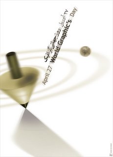
The first one is a poster of Mehdi Mohammadi named "April 27 World Graphic's Day". This one looks quite fuzzy and clean. The way objects are slanted combined with this blur also helps to create the feeling of motion. Mohammadi has used both Arabic and English language for his text. The selection of color for text is also fit with the theme of the design and it makes the world World Graphic's stand out.


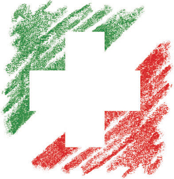
This poster has a quite long name which is "The Friendship Association of Iran and Switzerland identity". It is a design of another Iranian designer, Iraj Mirza Alikhani. This poster was inspired from national flags of Iran and Switzerland. The green and red colors of the Iran's national flag looks rough like they were painted by color pencils. The way using negative space to form the cross shape is also original.

References:
http://www.icograda.org


The Scar - Peter Prabowo

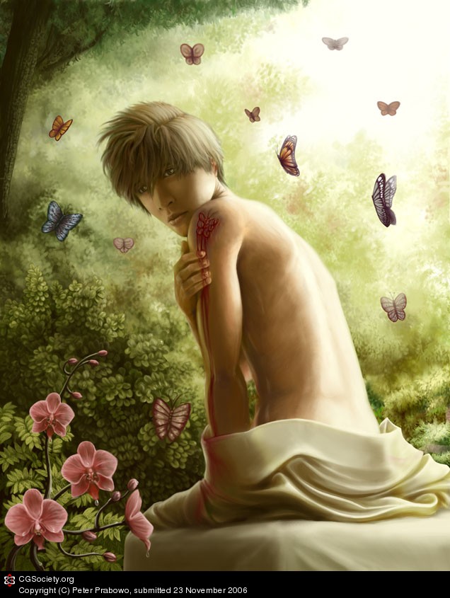
This piece, entitled "The Scar", is a artwork of Peter Prabowo - an Indonesian. It is an example of CG images, a kind of images produced with the help of tools in computer software. At the beginning, this picture was just a pencil drawing. Using Photoshop, Prabowo has colored the original sketch and adding some lightning effect and shades.

The whole image looks bright and smooth. And I really like the way he adding shadows which is very detailed on the clothes and on the face. The topic of this picture is also quite fantasy.

References:
http://forums.cgsociety.org/showthread.php?t=433017

Saturday, November 18, 2006

Color Theory

Color Basics

According to the definition in the worqx.com website, color is a perceptual characteristic of light. There are 3 major factors which are used in describing a color: its name, how pure it is and the value of its lightness. Hue is the value of the color (the color name), the purity of a hue is indicated by the value of saturation and the intensity value decides the brightness of a color.

A hue can has a number of variations which are created by mixing a pure hure with different colors. The 2 most important variation of a hue called shade: a variation produced by adding black color and tint: a variation produced by adding white color.

Major Color Systems

RGB Color System: this is an additive color system which is usually seen in computer screen. We call it as an additive color system because as more colors are added into it, it will produce a brighter result color. 3 primary colors of the RGB color system are Red, Green and Blue.

CMYK Color System: this system is called as a subtractive color system which is mostly used in printing. Although it only has 3 primary colors which are Cyan, Magenta and Yellow, the Black color is added into this system to produce a black color (practically, there is impossible to produce a pure black color by mixing cyan, magenta and yellow).

Besides these most popular ones, there are also have other color systems which are used in more specific situations such as the HSV color system.

The Color Wheel

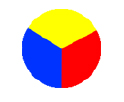
Traditionally, the color wheel is a color circle including 3 colors which cannot be produced by mixing any others colors. They are Red, Blue and Yellow. So, the color wheel with only these 3 primary colors is called as a primary color wheel.

Primary Color Wheel
The Secondary Color Wheel contains primary colors and colors produced by mixing primary colors.

Secondary Color Wheel

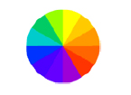
And the Tertiary Color Wheel addes colors formed by mixing primary colors and secondary.


Tertiary Color Wheel

Based on the Color Wheel, there are some terms describing the combination of colors:


Analogous Colors: the combination of colors which are located closed together on the color wheel.

Complementary Colors: the combination of colors located opposite each other on the color wheel.

Monochromatic Colors: the combination of a pure hue and its variations.

References:
http://www.worqx.com/color/color_basics.htm
http://www.colormatters.com/colortheory.html
http://www.worqx.com/color/complements.htm


web templates

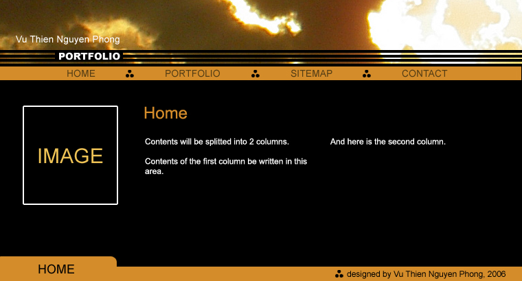
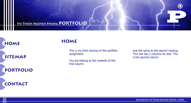
These are my 2 other web templates


This is my first design. I started this design by experimenting to combine 3 colors: black, white and dark orange. The color combination creates a lovely contrast and makes the text stand out clearly. Since I don't use background image, this piece has a clean design which will help audiences easier to read and navigate through the contents.The text for contents is arranged in 2 columns. I hope this arrangement creates more spaces for text and.


And this is my second one, it is quite similar to the first one with the way to design banner, footer and contents text. However, the theme of this design is different: main colors of this design are blue and white. The colors are also brighter which make this design look young and more dynamic.

Thursday, November 09, 2006

Website template


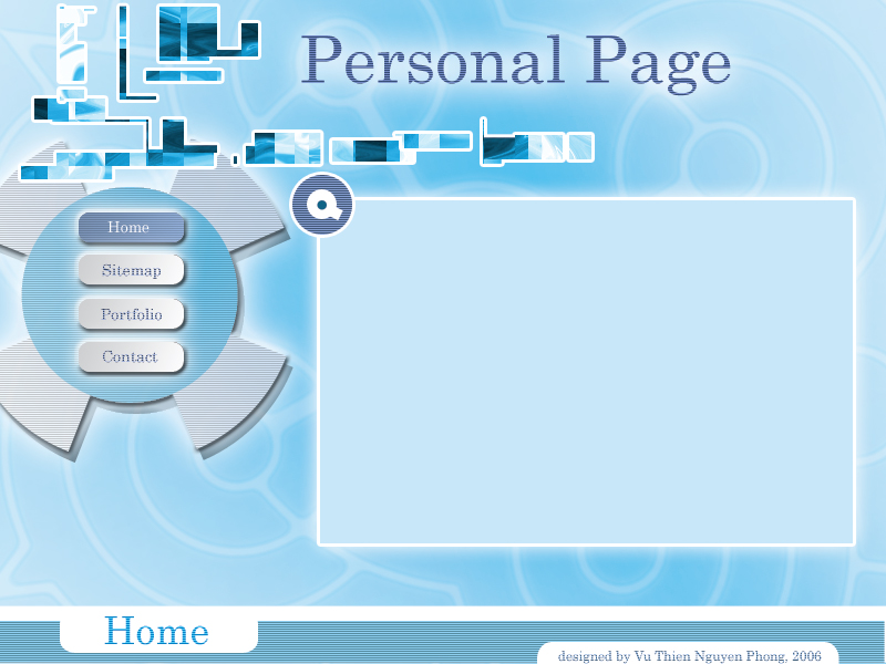
Here is my website template. I tried to make this layout look technological and a bit futuristic. However, I think this layout is lack of negative space because the banner (pieces of rectangle at the top) looks a bit messy.

Gelstalt exercise


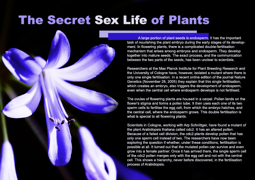
This is my Gelstalt exercise. I chose purple as the major color of this layout because it creates the feeling of mysterious. This feeling is quite suitable with the content of the article.

As the background picture is big and has a bright color, there is not much choice for me in choosing position for the text. I don't think it's a good idea to put the text on top of the flower picture. Therefore, I just put the paragraph in the blank area on the right. The 2 overlaped rectangles are used to highlight the content of the article.

Friday, November 03, 2006

Just playing arround with Photoshop

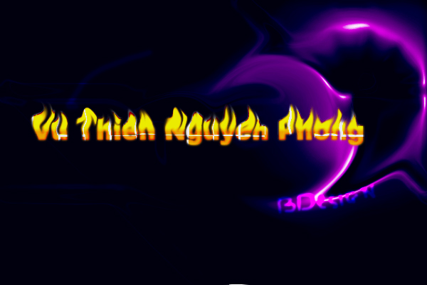
This image was much easier compared to the ladybug's image. I just used the brush tool (with the vivid light mode) in Photoshop to draw the background. You can see the purple light in the background has the shape like a "D". I also draw the word BDesign but because it was drawn by the computer mouse, it's not so good. The text "Vu Thien Nguyen Phong" is my full name. I applied gradient and the liquify effect to make it looks more interesting.

Ladybug on the leaf

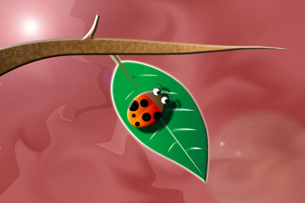
I drew this picture firstly on Illustrator. As I'm not good in using Pentool, I tried to make all objects from basic shapes. For example, the tree branch was actually a triangle. After distoring a bit, it became like that. And my last step was using Photoshop to paint the background and add shadows for the ladybug.

Thursday, November 02, 2006

Moon symbols


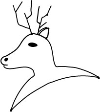
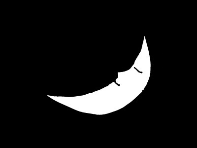
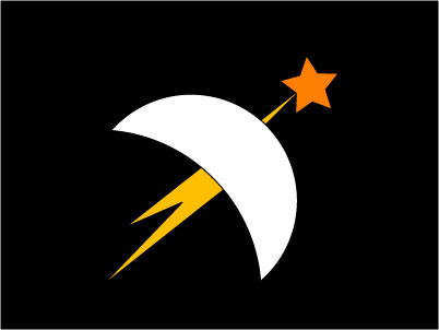
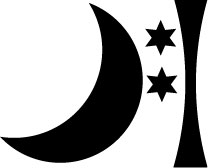
These following images are symbols of the Moon. I think the first one is my favourite. It was based on the Greek mythology of Artemis - the goddess of the Moon. The stag is a hunter who was transformed by Artemis because he accidentally saw she bathing.


Sun symbols


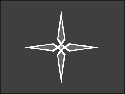
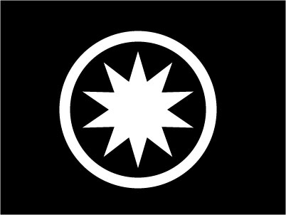
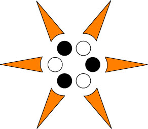
These are my symbols of the Sun. Generally, they are symmetric through the center - this feature is very common in Sun symbols. I like the second one best because it stands out clearly from the background and the outer circle stands for perfection.


Friday, October 27, 2006

Myths of the Sun and the Moon

1/ Mythology of the Sun
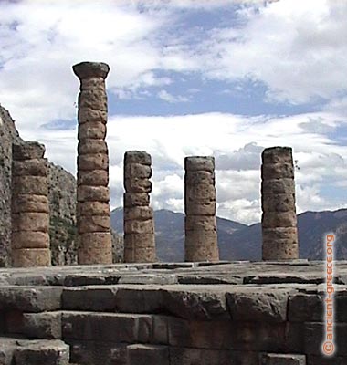
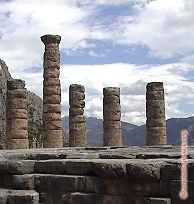
In Greek mythology, Apollo - son of Zeus - is the god of the Sun. He is also believed as the god of logic, music and even healing. The most famous temple of Apollo is the temple of Apollo at Delphi.


The Temple of Apollo at Delphi

With Japanese people, the Sun is represented by a woman - the goddess Amaterasu. There is a story that Amaterasu used to hide in a cave of heaven when she was treated badly by her brother. This made the world be covered in darkness. In order to made Amaterasu come out of the cave, other gods organized a party near the cave. Finally, Amaterasu came out of the cave and the light covered the world.


2/ Mythology of the Moon
Ancient Chinese people believed that there were 12 different moons and each moon represented for one month of a year. The mother of these moons is Heng-o. At the beginning of each month, Heng-o washed her children in a lake at the western side of the world. The each moon would travel in 1 month until it reached the eastern side of the word.

In Greek mythology, Artemis - Apollo's twin sister - was the goddess of the moon. She was also the goddess of the hunt. According to Greek legend, she had fierce temper. She and Apollo used to killed most of the children of Niobe, who had insulted her mother Leto.


References:
http://www.ancient-greece.org/images/ancient-sites/delphi/apollo-temple23.jpg
http://www.windows.ucar.edu/tour/link=/mythology/Definitions_gods/Apollo_def.html
http://www.windows.ucar.edu/tour/link=/mythology/amaterasu_sun.html
http://www.windows.ucar.edu/tour/link=/mythology/artemis.html
http://en.wikipedia.org/wiki/Image:Diane_de_Versailles_Leochares.jpg

My first web layout


Welcome to my first post of semester 3. This is the webpage which I designed in the semester break. Actually, I designed it for my father - a highschool mathematics teacher. He has some maths classes at home; so he wants his students can download exercies and lectures from the website (I think another reason is because he didn't want me to play all the semester break :D).

His website is at http://www.thiencan.net/. You can take a look at it to see the full website.
Anyway, it just a small website with 6 html files to introduce about my father, some maths exercises to download and some family photos. I used a lot of blue lines and overlapped objects on the white background to create a modern style. The small number of colors and typography also helping this webpage to looks clean and bright.

As I don't like complex tables which often make me mess up, I decided to design the website in Illustrator (including the heading) and then split it up with the Photoshop slice tool. The only problem of that is there are many images are created. As each page of the website was divided into 19 parts averagely, there were total nearly 120 images just for the background (there were 30-40 more for family pictures). I don't know how to solve this problem and it really takes a lot of time for uploading using HTTP protocol (I can only upload 12 files at one time).

Sunday, September 17, 2006

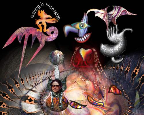
No Thing Is Impossible

This pic names "No Thing Is Impossible". It's a work of Anjo Lafin. He combines a lot of objects including vector objects, bitmap pictures and even his own photograph in this artwork. Through the complicated combination, the artist tries to say that there is no limitation for digital artworks; and whatever you can imagine, you can express.

References:
http://www.digital-art-ways.com/

Celia Duncan's Artworks

More Attitude


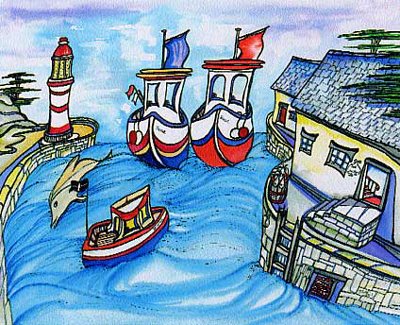
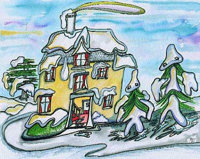
Winter Walk

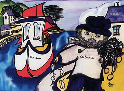
These are pictures of Celia Duncan. In her websites, these pictures have price from $5 to $200. Her works were inspired mainly from Cornwall ( a small city in Great Britain) and she uses a unique style to depict houses, boats and people of this city. Celia's pictures also use a lot of primary colours and bold lines which make the pictures look bright and dynamic.

References:
http://www.celiaduncan-artworks.com/images/winterwalk.jpg
http://www.celiaduncan-artworks.com/images/moreattitude.jpg


Sunday, September 10, 2006

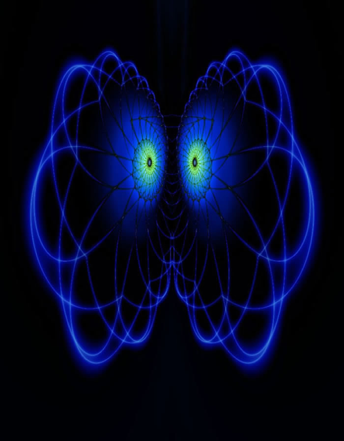
Green Eyes


This picture is created by a person who has nickname bolenat in the DeviantArt forum. The main colours of this picture is blue and black, so it makes the 2 green circles which the artist calls eyes pop out the picture. When viewers look at this picture, they can interpret it in many ways such as it looks like a face, a brain or an electric storm.

References:
http://www.deviantart.com/deviation/39493188/

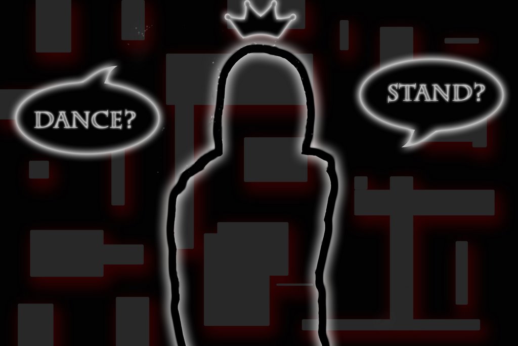
Dance or Stand


This is the picture of kuroneko. It looks really simple with only lines and text; but actually, the artist has processed it from the real photographs. I really like this picture because it does not focus too much on the positive space and we can see the balanced composition between positive and negative space.

References:
http://www.deviantart.com/deviation/39493200/

Sunday, September 03, 2006

Digital Art

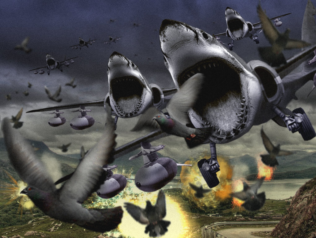
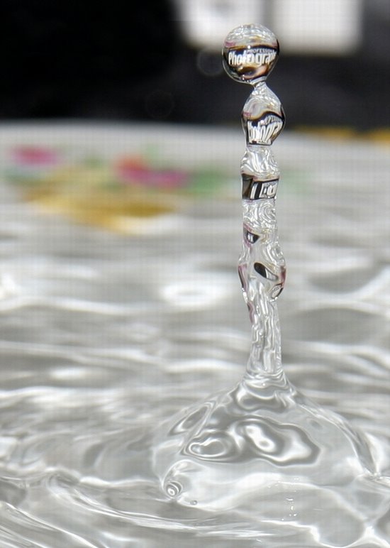
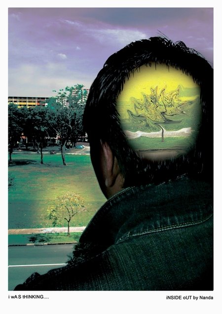
Digital art are the combine between ordinary photographs and digital painting and processing. In the digitalart.org, they call it photographic manipulation. I really like these picture because not only they are beautiful but they also help to express the artist's imagination and ideas which are cannot be present by words.

Apocalypse by Daniel Sinoca

Unbroken Chain by Stephen Trenkamp
Water Sculpture by Nanda
Inside out

References:
http://digitalart.org/artwork.php?ID=52431
http://digitalart.org/artwork.php?ID=52371
http://digitalart.org/artwork.php?ID=51992
http://digitalart.org/artwork.php?ID=51874

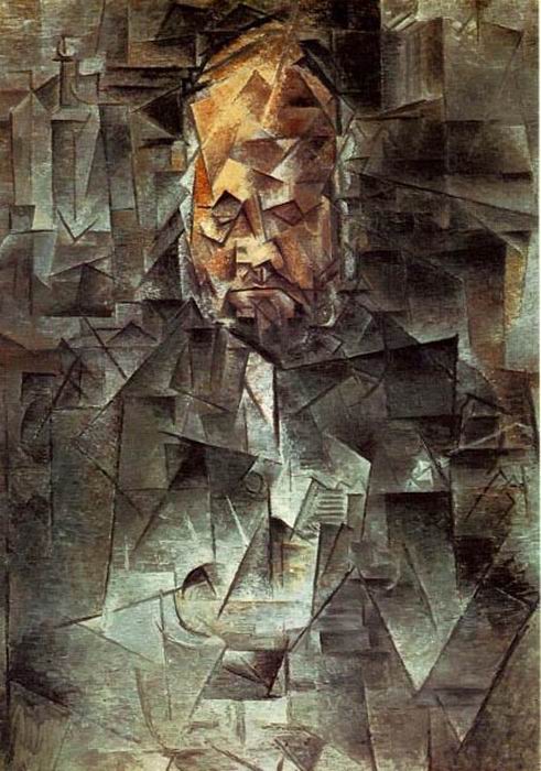
Cubism

Cubism was an early 20th century art movement which was begun in
European painting and sculpture. Pablo Picasso and Georges Braque are
main innovators of it. Although this movement appeared in many fields
such as music, it is mainly known as the style of paintings.

In this kind of artwork, objects are broken and re-assembled in an
abstracted form - The artist depicts the object from a multitude of
viewpoints instead of the ordinary one viewpoint.

So, these below pictures are the notable examples of Cubist artworks.

Ambroise Vollard by Pablo Picasso


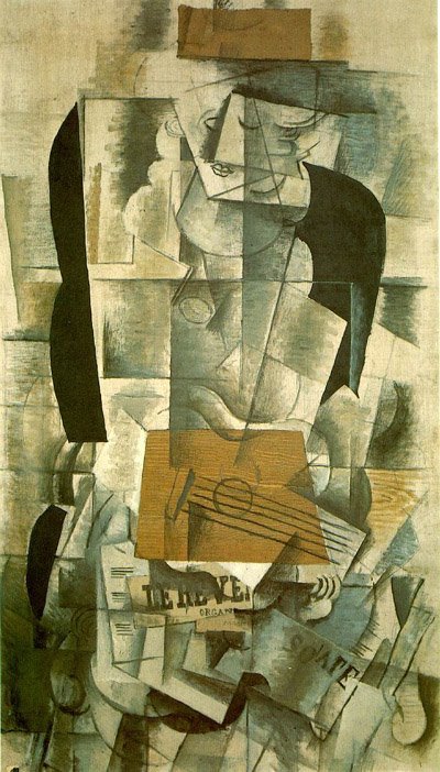
Woman with guitar, Georges Braque

References:
http://en.widipedia.org/wiki/Cubism
http://en.wikipedia.org/wiki/Cubismhttp://en.wikipedia.org/wiki/Image:Braque.woman.400pix.jpg