This is my type exercises including: creating layout for an essay, creating layout for a recipe and make 3 variations of the real estate logo.
When designing a layout, the most difficult part that I encoutered was drawing decorative items (eg. these circles in my essay layout). I wanted to use more decorative items to make my layout look professional, but it became hard to choose colours for them (there is a limit number of colours that are match together).
The Essay Layout

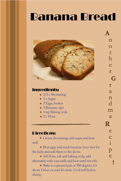
The Recipe Layout
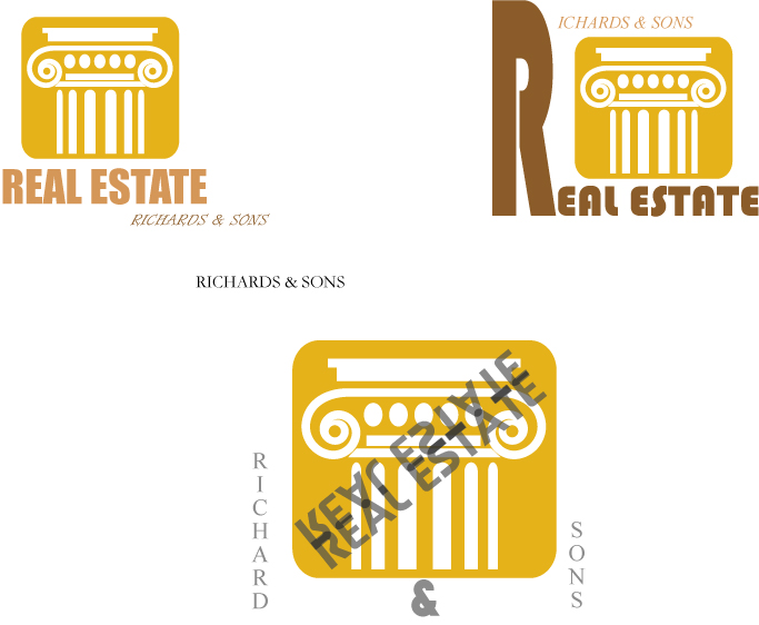
Variations of the Logo
2 comments:
I see you can play with Illustrator! Your stuff is kind of harmonious and smooth. Besides, you're goos at using white spaces and dark colors.
I like the first one best, but others are very impressive to me either!
Good work, Phong ^.^
For your essay layout, you did a really great job on the bottom half.
As for the top section, it has a playful quality that does not really reflect the subject matter. Since you already included the author's name in on left-hand side, I would remove it from the the top of this portion. You don't need to repeat the author's name again. I would also move the subheading somewhere else, possibly closer to the headline.
In your recipe layout, I like the headline font a lot.
The font for the blue text does not really go well with it though. The blue is actually pretty hard to read. When using a bulleted list, make sure the text lines up the left-hand side. The placement of the letters for "Another Grandma Recipe!" feels like you couldn't make up your mind about aligning the text or not. If you do not want them to line up, then make it obvious. Move the letters around more, otherwise, use a center alignment so that we can read it.
The logos for the Real Estate don't really stand out. I think the one in the upper right hand corner where you played with the "R" and use it for both Real Estate and Richards & Sons shows promise. Its a good idea, just needs a bit of tweaking.
Post a Comment