Friday, October 27, 2006

Myths of the Sun and the Moon

1/ Mythology of the Sun
In Greek mythology, Apollo - son of Zeus - is the god of the Sun. He is also believed as the god of logic, music and even healing. The most famous temple of Apollo is the temple of Apollo at Delphi.


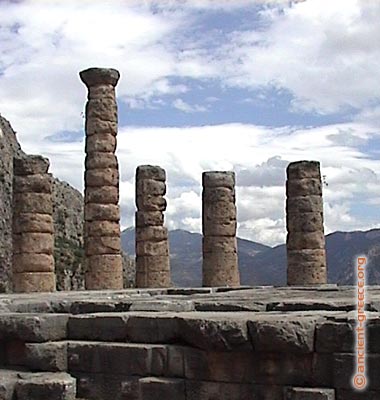
The Temple of Apollo at Delphi

With Japanese people, the Sun is represented by a woman - the goddess Amaterasu. There is a story that Amaterasu used to hide in a cave of heaven when she was treated badly by her brother. This made the world be covered in darkness. In order to made Amaterasu come out of the cave, other gods organized a party near the cave. Finally, Amaterasu came out of the cave and the light covered the world.


2/ Mythology of the Moon
Ancient Chinese people believed that there were 12 different moons and each moon represented for one month of a year. The mother of these moons is Heng-o. At the beginning of each month, Heng-o washed her children in a lake at the western side of the world. The each moon would travel in 1 month until it reached the eastern side of the word.

In Greek mythology, Artemis - Apollo's twin sister - was the goddess of the moon. She was also the goddess of the hunt. According to Greek legend, she had fierce temper. She and Apollo used to killed most of the children of Niobe, who had insulted her mother Leto.


References:
http://www.ancient-greece.org/images/ancient-sites/delphi/apollo-temple23.jpg
http://www.windows.ucar.edu/tour/link=/mythology/Definitions_gods/Apollo_def.html
http://www.windows.ucar.edu/tour/link=/mythology/amaterasu_sun.html
http://www.windows.ucar.edu/tour/link=/mythology/artemis.html
http://en.wikipedia.org/wiki/Image:Diane_de_Versailles_Leochares.jpg

My first web layout


Welcome to my first post of semester 3. This is the webpage which I designed in the semester break. Actually, I designed it for my father - a highschool mathematics teacher. He has some maths classes at home; so he wants his students can download exercies and lectures from the website (I think another reason is because he didn't want me to play all the semester break :D).

His website is at http://www.thiencan.net/. You can take a look at it to see the full website.
Anyway, it just a small website with 6 html files to introduce about my father, some maths exercises to download and some family photos. I used a lot of blue lines and overlapped objects on the white background to create a modern style. The small number of colors and typography also helping this webpage to looks clean and bright.

As I don't like complex tables which often make me mess up, I decided to design the website in Illustrator (including the heading) and then split it up with the Photoshop slice tool. The only problem of that is there are many images are created. As each page of the website was divided into 19 parts averagely, there were total nearly 120 images just for the background (there were 30-40 more for family pictures). I don't know how to solve this problem and it really takes a lot of time for uploading using HTTP protocol (I can only upload 12 files at one time).

Sunday, September 17, 2006

No Thing Is Impossible

This pic names "No Thing Is Impossible". It's a work of Anjo Lafin. He combines a lot of objects including vector objects, bitmap pictures and even his own photograph in this artwork. Through the complicated combination, the artist tries to say that there is no limitation for digital artworks; and whatever you can imagine, you can express.

References:
http://www.digital-art-ways.com/

Celia Duncan's Artworks

More Attitude


Winter Walk

These are pictures of Celia Duncan. In her websites, these pictures have price from $5 to $200. Her works were inspired mainly from Cornwall ( a small city in Great Britain) and she uses a unique style to depict houses, boats and people of this city. Celia's pictures also use a lot of primary colours and bold lines which make the pictures look bright and dynamic.

References:
http://www.celiaduncan-artworks.com/images/winterwalk.jpg
http://www.celiaduncan-artworks.com/images/moreattitude.jpg


Sunday, September 10, 2006

Green Eyes


This picture is created by a person who has nickname bolenat in the DeviantArt forum. The main colours of this picture is blue and black, so it makes the 2 green circles which the artist calls eyes pop out the picture. When viewers look at this picture, they can interpret it in many ways such as it looks like a face, a brain or an electric storm.

References:
http://www.deviantart.com/deviation/39493188/

Dance or Stand


This is the picture of kuroneko. It looks really simple with only lines and text; but actually, the artist has processed it from the real photographs. I really like this picture because it does not focus too much on the positive space and we can see the balanced composition between positive and negative space.

References:
http://www.deviantart.com/deviation/39493200/

Sunday, September 03, 2006

Digital Art

Digital art are the combine between ordinary photographs and digital painting and processing. In the digitalart.org, they call it photographic manipulation. I really like these picture because not only they are beautiful but they also help to express the artist's imagination and ideas which are cannot be present by words.

Apocalypse by Daniel Sinoca

Unbroken Chain by Stephen Trenkamp
Water Sculpture by Nanda
Inside out

References:
http://digitalart.org/artwork.php?ID=52431
http://digitalart.org/artwork.php?ID=52371
http://digitalart.org/artwork.php?ID=51992
http://digitalart.org/artwork.php?ID=51874

Cubism

Cubism was an early 20th century art movement which was begun in
European painting and sculpture. Pablo Picasso and Georges Braque are
main innovators of it. Although this movement appeared in many fields
such as music, it is mainly known as the style of paintings.

In this kind of artwork, objects are broken and re-assembled in an
abstracted form - The artist depicts the object from a multitude of
viewpoints instead of the ordinary one viewpoint.

So, these below pictures are the notable examples of Cubist artworks.

Ambroise Vollard by Pablo Picasso


Woman with guitar, Georges Braque

References:
http://en.widipedia.org/wiki/Cubism
http://en.wikipedia.org/wiki/Cubismhttp://en.wikipedia.org/wiki/Image:Braque.woman.400pix.jpg

Sunday, August 27, 2006

Assignment 4


This is my book cover assignment. After submitting, I recognized that I made a mistake about the position of text on the spine. But anyway, footprints in my design are inspired from the idea of the traveller. The picture of a rainy day was put into the footprint. And I also tried to create a background which is fuzzy like a fog with the combination between dark and light areas; and after playing with the photoshop brush for a while, I got this background.

Tehran Theatre Logo


This logo is designed by Maziar Zand. It is inspired from the traditional logo for theaters (the smiling face and the sad face). But the artist created a new design which has a very modern and dynamic style.

References:
www.icograda.org

Sunday, August 20, 2006

Icograda

Icograda is a very intresting website with hundreds of graphical design from many artist. These are 2 artworks in this website.


Career Development Center identity of Anatol Kuzmi. These symbols represent for stair's steps from low to high of the career and they also show the position of a worker at each step (for example: the lowest step is the employee bowing and the last step depicts the stance of the big boss).


Hiroshima is a poster of Tarik Jesenkovic. I like it because it uses a very simple shape to express the meaning. This poster is inspired from the national flag of Japan with the meaning that Hiroshima is the black point of the human history.

Reference:
http://www.icograda.org/

Alien Vision


Bird Thing


Discgo


Dragon Bomber

These paintings are drawn by James Eugene Albert, he calls them as "Alien Vision". I like the way he used computers in his work. Through these pictures, he tried to put souls into his paintings.

He also said that "In my world, complete mastery of my tools is my ability to take a slightly souped-up "ordinary " desk top computer and turn it into a virtual set of artist's palettes and tools that can create extraordinary art." (James Eugene Albert)

References:http://www.worldfineart.com/

Sunday, August 13, 2006

Islamic Arts

Islamic art is a term used to describe artworks influenced by Islamic cultures including architecture, painting, calligraphy, pottery and metalwork. So, characteristics of this kind of art are often defined by the philosophies of Islam.

This is an example of pottery with the Arabic word at the center of the disk means Allah.


Instead of depicting human figure like in Christian art, in some Muslim cultures such as Arab Islamic Art, depictions of human being are forbidden. This reason leads to the lack of portraits in Islamic art even portraits of the Prophet Muhammad.

An example of geometric designs:

Islamic art is mainly focus on Allah, and as Allah cannot be represented by pictures, Muslims usually uses geometric designs to symbolize him. Another important branches of Islamic art is Arabic calligraphy which is used to express the beauty in the verse of Qur'an.

These are 2 example of Arabic calligraphy which are Diwani and Farsi fonts.


References:
http://en.wikipedia.org/wiki/Islamic_Arts
http://www.turkeytravelplanner.com/http://www.jorgetutor.com/
http://tallis.umd.edu/~pfeifer/turkey/images/I/13

Signed and Sealed

"Signed and Sealed" is a series of 30 lithographs of Pat Elliott Shircore. These lithographs were extracted from the orginal Treaty of Nanjing document which was signed in 1842 when China gave Hongkong to Britain. Pat has scanned them into her computer to do the digital processing to improve the quality of the original lithographs.


Not only having historical values, these lithographs also have values in art with texture, charactors and seals.


These following images are some example of the "Signed and Sealed" collection.


References:
http://www.artasialink.com/

Sunday, August 06, 2006

Creating a banner with matrix effect

Step 1: Create a 500x200 pixel image with white background

Step 2: Filter/Texture/Grain with Grain Type = Vertical, intensity and contrast both equal to 100%.


Step 3: Filter/Artistic/Neon Glow with Glow Color is green.


Step 4: Filter/Stylize/Glowing Edges


After step 4, you will have the result like this.


Use Image / Adjustments / Hue/Saturation to change the color into green.


Finally, your matrix banner will look like this picture.


References:
http://www.newtutorials.com/matrix-effect-tutorial.htm

Creating A Channel Mask in Photoshop

Channel Mask is the most time-consuming mask in Photoshop but it allows you to make accurate selections for complex objects such as hair or leaves which the other tools can not do (Lasso or Magic Wand tools).
For example, I will use channel mask to select my brother’s hair from his picture to illustrator how to use mask.

This is the original image


Step 1: Open the channel palette and find in your existing channels to find a channel which has the most contrast between what you want and don’t want to select.
In this case I use the Green Channel

Step 2: Duplicate your chosen channel. Until now, we only work in this channel.

Step 3: Choose Image – Adjustments – Levels. Use the histogram to increase the contrast between the element you want and don’t want to select.


Step 4: Use brush to refine the mask. Paint white color for areas you want to add in your selection and black to remove them from the selection. This step will take you most of your time to finish. In this case, as I paint black for the hair and white for the other areas, I need to reverse the selection after finish the mask.


Step 5: Now, you’ve had a very precise channel mask. The only work is only loading this mask as your selection.


Sunday, July 30, 2006

Saigon Running Club Card


The background was filled with gradient orange as I want to create the sense of energy. On this card, I used 2 fonts with 4 different colours to create the variant for text.

My Business Card


This is my business card. Due to follow exercise requirements, I can't do much with the text. I only change the font size, bold/italic and apply the effect.

Sunday, July 23, 2006

Type Exercises

Hi,
This is my type exercises including: creating layout for an essay, creating layout for a recipe and make 3 variations of the real estate logo.

When designing a layout, the most difficult part that I encoutered was drawing decorative items (eg. these circles in my essay layout). I wanted to use more decorative items to make my layout look professional, but it became hard to choose colours for them (there is a limit number of colours that are match together).


The Essay Layout


The Recipe Layout


Variations of the Logo


An example of picture drawn by computer software


The author of this picture has drawn it by a computer software. I like the way he using colours. The greenish sky looks totally unrealistic and it makes me think about the sky in some cartoon or computer games.The tree which is growing in the horizontal direction and clouds floating nearly the ground create the sense this is the land on a different planet.

References
http://www.deviantart.com/view/33554525/